Behance Best Practices: Filling Out Your Profile

Whether you’re brand new to Behance or have been with us since day one, a major key to finding success with Behance is to have as complete a profile as possible. This means different things to different people, but Behance offers a ton of ways to connect the different parts of your digital life in once place.

Screen Shot 2014-09-25 at 11.58.57 AM

Read more →

Layer Tennis: Season Four Opener

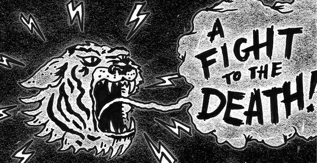
A fight to the death; the battle of Long Island

Last week two New York based designers and Behance users competed against each other in the season opener of a match of creativity. Known as Layer Tennis, this contest is the “rap battle” of visual arts, in which two competitors face off through the layering of an illustration. Originally coined Photoshop Tennis, Layer Tennis began at Coudal Partners when a few creatives traded a Photoshop document back and forth taking turns adding layers. Coudal Partners brought the game live to their website, and it has had a following ever since. With the help of Adobe Creative Cloud, the idea has expanded, with 3 full seasons of matches.
1

So, what are the rules?
A coin toss decides which artist begins the battle, giving the winner an edge and complete artistic freedom to create the first image as he/she pleases. The artists pass the file back and forth in real time, with fifteen minutes to complete a “volley,” adapting the presentation of the image as they go. There are ten volleys in a match, allowing the last image to be as the last word in a game of telephone is, entirely different from the first! All the while, a third contributor is providing play-by-play commentary of the action.

So, who are the players?
The players are not only limited to designers; they may be animators, illustrators, or whatever else. To open up the fourth season Jon Contino was up against Dan Cassaro. As commentator Rosecrans Baldwin put it, the two have a ton in common. “Both have their own studios. Both love lettering, full stop. Both are natives of New York City, multitalented, multifaceted, and they each appear to dabble in pretty much everything a designer can do.”

Read more →

Behance Member Testimonials: September 2014 Update

As many Behance members know, being Featured by our curation team is a hard feat to achieve! Our Curators (there are two of them!) look at thousands of projects every day and pick the best of the best. We’ve recently started reaching out to our Featured Members to hear about their experience using Behance and here’s what a few have had to say:

“It’s an honour for me to be 
featured on the website that I love and respect the most, being featured 
among these amazing works is one huge acheivment for me. I got the email 
while I was playing with my 3 month baby girl! So you can imagine that I 
was already feeling awesome, but when I got your email the feeling just 
quadrupled.”

Oasim Karmieh, Brasov, Romania

9348905c61df982e24851fa20ea05cf6

Read more →

Behind the Project: Air Review

In this series, we look deeper into some of the projects on Behance.net that are especially admired in our community. Joseba Elorza is a sound technician turned artist who creates surreal illustrations through collaging techniques. He was recently asked to create video for the band Air Review‘s song “Young.” His use of images and layering creates impossible worlds through which a child runs. It is our good fortune to allow you to delve deeper into the making of the video, “Young.”

What was your inspiration for this project?
Air Review asked me to try to represent the road to maturity of a child and I thought that we could make that path literal and see a child running toward an uncertain future.

Air Review

The theme of childhood gives you a lot of freedom to represent dream elements. The surrealism usually found within my works fit in very well, so I tried not to limit myself and let the process where I search for the footage take me without a specific horizon.

There was not a clear particular source of inspiration, but the creative process itself ended up being the biggest inspiration possible, and in this sense the band gave me a lot of freedom to choose which way to take the project.

Can you describe your process in creating this project?
After establishing some guidelines and a main idea, I spent a lot of time searching for the right footage in public domain libraries. At this point, and given that I depend largely on what I can find out there, the original idea or the script can be altered by what I’m finding, making the whole process very natural and fluid in my opinion.

Read more →

Behind the Project: Michael Roulier

In this series, we’ll look deeper into some of the projects on Behance.net that are especially admired in our community. Michael Roulier is a photographer specializing in food and cosmetic visuals, having published more than 30 books in collaboration with three star Michelin culinary chefs. His project on Behance, Michael Roulier, contains photographs featured to help create a book for Anne Sophie Pic, a three star Michelin chef herself.

What was your inspiration for this project?
I was commissioned by Hachette, a French Publishing company to create a “sumptuous” book about Anne Sophie Pic, a French 3 star Michelin chef, a woman in a man’s world; an exception. Hachette knew very well that I would have to be left completely free on the creative part to accept a three weeks time project.

I had already worked with Anne Sophie, so we knew each other quite well. At this level, being a chef, means above all being an artist. This project was supposed to be her published food “manifesto.” The text was written by Stéphane Davet, a journalist specialized in rock & roll, but equally passionate about food.

The 48 images we had to do, like a true photography book, would appear naked, unadorned, and apart from the text.

Michael Roulier 2 Read more →

Behind the Project: Cinema

In this series, we look deeper into some of the projects on Behance.net that are especially admired in our community. Franck Bohbot is a photographer and visual artist, mainly focusing his artistic research on public spaces and urban landscapes. Each one of Franck’s series features certain photographic intentions — through their enigmatic atmosphere, documentary-style approach, and timeless feel. We were fortunate enough to delve deeper into one of his projects on Behance, Cinema.

What was your inspiration for this project?
For The Cinema Series, my principal inspiration was to honor the Art of Cinema by showing the atmosphere of movie theaters specifically in the state of California. Entering a Cinema instead of watching movies on your smartphone or computer gives a real emotion to the public. I think because of the new media, we are losing step by step, the pleasure to going to your local Cinema.

Cinema Read more →

Announcing Portfolio Review Week #6: November 3-10, 2014


Portfolio Review Week #6: November 3-10, 2014

We first launched Portfolio Review Week in 2012 with the goal of bringing together creatives to share their work and develop their craft. In the five Portfolio Reviews since then, we’ve been amazed by the stories, photos, and videos of creatives coming together in their communities across 80 countries.

Portfolio Review Week #6 will be held November 3-10, 2014. We’re looking forward to a week of incredible events put together by first time and veteran hosts worldwide!

Be a leader in your local creative community by hosting a Portfolio Review
If you’re willing to devote some time and energy to planning, promoting and executing a Behance Portfolio Review — you’re in!  Get started by filling out this form.

Just want to attend? Check meetup.com/behancereviews in the coming weeks for events near you!

picframe_prw52

Learn more about Portfolio Review Week at behance.net/reviews

A Closer Look with Carl Sutton

Meet Carl Sutton. He is a graphic designer and illustrator living in Wales. His work is an exploration of deconstruction, anatomy, entomology and symmetry and we had the pleasure of getting a closer look into his projects, process and ProSite.

How long have you been working in your creative field?
I’ve been working commercially since I graduated in 2009. Since then I’ve floated between studio and freelance work. These days I work on personal and commercial projects side by side.

Screen Shot 2014-08-14 at 4.29.36 PM

Do your personal projects differ from your professional work? If yes, how so?
Over the years I’ve slowly seen the gap between commercial and personal work close. I try to take as much opportunity with commercial design as possible. I enjoy the challenge of visual communication through collaboration. Visually interpreting concepts or generating ideas from discussions. I retain a certain visual style throughout all of my work but I’m happy to experiment a little more with commercial projects. Widen the palette and try new things.

Read more →

Behind the Project: Cloud City

In this series, we’ll look deeper into some of the projects on Behance.net that are especially admired in our community. Together, Julie Wilkinson and Joyanne Horscroft are The Makerie Studio, a creative collaboration producing unique three dimensional paper sculptures for both commercial and artistic purposes. They are inspired by forgotten worlds, rare prints, and the beauty of details, allowing them to create unique pieces. Cloud City is their most recent project uploaded to Behance.

What was your inspiration for this project?
The inspiration for Cloud City came from an obsession with Moroccan arches and architecture, something we’d been eyeing up for over two years and really wanted to use for one of our pieces. We’d started drawing up a few intricate designs based on real buildings, but that had us stumped for a while because the buildings were already so beautiful. It was hard to know what to do next, and how to make them our own in some way. But when we distilled what it was that we loved about them - the pattern making, the colours, the structure - we thought it would be lovely to take these very rational details into a dreamier, illogical realm. And that’s how we ended up with floating egg palaces connected by ladders in the sky…

11

Read more →